
Making Good Viz
There is an enormous amount of scholarship and debate about what makes for effective graphs and I can't possibly do the field justice. Below is simply one person's distillation of some tips that are reasonably well agreed upon. I'm aiming for concise here so that we can practice, but if you want more, visit the links below and links in the last lecture.
Don'ts
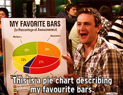
- pie charts: humans stink at interpreting angles
- stacked bar charts: tough to decode trends
- make your reader do math: if $x-y$ is interesting, don't plot $x$ and $y$ separately
- misleading scales
- 3D unless absolutely necessary (and it almost surely isn't)
- distracting chart junk
- unnecessary colors
An illustration of some of those Don'ts in practice:
Another example to not replicate:
Do's: slides 49-64
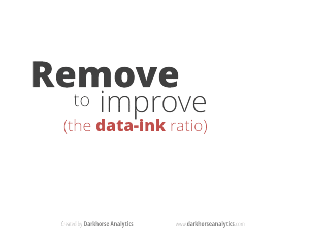
- Show the data, reduce the clutter, and integrate the text and the graph
- graphs should aspire to be sufficient to understand without reading the text
- Control the aspect ratio
- Think about whether you need to include zero. Sometimes excluding it makes the figure misleading. Sometimes including it (and expanding the y-axis to do so) can hide the variation you're describing.
- Facilitate comparisons:
- by placing figure components next to or above (depends!) the stuff it is compared to
- by using the same axis (two y-axes is usually bad!)
- labels > legends! (so readers eyes don't have to dart back and forth)
- sort in meaningful orders (i.e. not alphabetically!)
Transforming bad figures to good ones
- Tell a story (let's look at this)
- Let's look at the before/after pics here: https://pubs.aeaweb.org/doi/pdf/10.1257/jep.28.1.209 This article is also wonderful for understanding the "why"s of good data viz
- SERIOUSLY: THAT'S A GREAT ARTICLE.
Practice: Thinking and planning
TSP: Which type of graph (bar, line, or histogram) would you use for:
- The volume of apples picked at an orchard based on the type of apple (Granny Smith, Fuji, etcetera).
- The number of points for each game in a basketball season for a team.
- The count of apartment buildings in Chicago by the number of individual units.
- Suppose we create a scatter plot but find that due to the large number of points it's hard to interpret. What are two things we can do to fix this issue?
- Suppose that we create an n by n FacetGrid. How big can n get?
- What are the two things about faceting which make it appealing?
- When is pairplot most useful?
(The answers are available in the raw ipynb file for this class within the lectures repo.)
Practice: Fixer Upper
The usual process is to start making figures that are simple and then iterating to improve them. Naturally, almost all figures start, well, not great.

Work with the classmate next to you and improve our "first pass" figures we started last class.
Use the guidelines above.
My turn: Oh the possibilities
In the last lecture page, I introduced a larger set of firm accounting variables. I want to show you how far we can push this.
If you want to see the code that makes these, view the raw ipynb file on GitHub The code uses plotly's subpackage plotly-express which is ridiculously easy to use.
Before next class
- Improve all of the plots in the Visualization Practice page.
- Flip through the links above and the references in the Making Viz page. Make note of any neat chart types or alterations that improve charts that you would like to implement sometime.
- Now that we have most of our toolkit in place, read What I do when I get a new data set as told through tweets.