
Making a Viz
Plotting is useful for
- Exploring data: Understanding the structure of the data is absolutely essential to any analysis.
- Discovering and presenting trends, comparisons, and relationships (results): Pictures are worth a thousand words.
A common data science work flow:
- Get data
- Ask question
- Modify data and plot/model to (possibly) answer question
- Refine question or ask new question and return to step 2 or 3 and proceed.
Notice: We're in an infinite loop now. Point being: You should be plotting your data A LOT. For every figure I include in research papers, I've created literally hundreds of figures no one else will ever see.
This also points out that exploring data is an iterative process, during which you should "investigate every idea that occurs to you. Some of these ideas will pan out, and some will be dead ends. As your exploration continues, you will home in on a few particularly productive areas that you’ll eventually write up and communicate to others." (Garrett Grolemund and Hadley Wickham)
Why plot our data?
I know I just said why above in general terms ("exploring data and presenting analysis") but I want to show you a few classic examples.
Anscombe's quartet
Is four datasets with identical means and standard deviation for two variables:
import pandas as pd
import seaborn as sns
import matplotlib.pyplot as plt  # sometimes we want to tweak plots
import numpy as np

df = sns.load_dataset("anscombe")
df.groupby('dataset').describe() # works, but a lil ugly...
df.groupby('dataset').describe().swaplevel(axis=1)[['mean','std']] # just report means and std
A regressionista says: "$x$ and $y$ all have the 'same relationship': $y = 3 + 0.5*x$"
But... just take one look at the figure below. Is that statement accurate?!
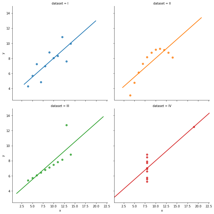
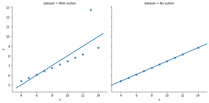
... but it should be positive, taking the groups (colored below) into account:
The online book version of "Data Visualization: A practical introduction" by Kieran Healy notes that
Illustrations like these demonstrate why it is worth looking at data. But that does not mean that looking at data is all one needs to do. Real datasets are messy, and while displaying them graphically is very useful, doing so presents problems of its own. [As we will see next lecture], there is considerable debate about what sort of visual work is most effective, when it can be superfluous, and how it can at times be misleading to researchers and audiences alike.
Just like with tables of numbers, graphs deliberately simplify things to help use peer into the cloud of data. Still, we will not automatically get the right answer to our questions just by looking at these summaries. This is why we will cover more rigorous methods to uncover statistical relationships later in the course.
Yet, summary stats and graphs are an absolutely necessary starting point.
Tips
Generally, to plot in Python:
- Put your data into a DataFrame
- Format the data long
- Use
pdorsnsplotting functions.- Use which ever is easiest! Pandas can do bar, "barh", scatter, and density. Go with
seabornotherwise. - Start with basic plots, then layer in features
- Get the "gist" of the figure right
- Use which ever is easiest! Pandas can do bar, "barh", scatter, and density. Go with
- If you need to customize the figure, you'll end up using
matplotlibwhich is a full-powered (but confusing as heck) graphing package. In fact, bothpandasandseabornare just usingmatplotlib, but they hide the gory details for us. Thanks,seaborn!- Only customize when necessary for hyper control. Focus on CONTENT over hyper-control of formatting.
- Some "format" tweaks (add a title, change the axis titles) and choices about plotting can be quick/cheap and have high value, and you should do these right before you finish your project/assignment and are about to post it officially. Otherwise, focus on content.
When you want to customize your figures, go to these links first: elements of a python figure, anatomy of a figure as "fig" and "axes" objects (How its objects are made, stored, and accessed. Only read the "parts of a figure" section), and effective customization
Also,
- Start with simple graphs, and then build in and layer on "complications" and features.
- Really compare your code with the syntax in the documentation. Understanding what each parameters does and needs is essential.
- Triple check for typos, unclosed parentheses and the like.
Which graph should I make?
Which type: This will help you pick what type of graph is useful for a given situation, and each chart has an infographic describing it along "common mistakes" to avoid for that chart type: https://www.data-to-viz.com/
Quick exercise: Go to that link and find a nice chart type to plot leverage by industry.
How to make it:
- https://www.data-to-viz.com/ has Python examples in
seabornfor most but not all graphs - https://python-graph-gallery.com/ is very helpful as well
- The
seaborntutorial page is excellent: https://seaborn.pydata.org/tutorial.html
"This graph can't be made"
Most graphing pain comes from insufficient data wrangling (per Jenny Bryan). Most plotting functions have assumptions about how the data is shaped. Data might be unwieldy but we can control it:

How?
- Keep your data in "tidy form" (aka tall data aka long data).
Seabornexpects data shaped like this. Long data is generally better for data analysis and visualization (even aside from Seaborn's assumptions) - The exception: Pandas. If you want to plot using a
pandasplot function, you might have to reshape (temporarily) your data to the wider "output shape" that corresponds to the graph type you're generating.
Should I use sns or pd to do plot X?
A: Which ever is easiest! panda's plotting functions are simple and good for early stage and simple graphics, but seaborn has many more built in options and has simpler syntax/easier to use.
Note that, as mentioned above, the shape of the data matters for all plotting functions.
I want to Facet my figure, but...
(Skip this during the lecture. This will make sense later, but is here for future reference.)
...I want to split the rows (or columns) by a (A) continuous variable or (B) a variable with too many values.
The solution to
- (A) is to partition/slice/factor your variable into bins using
panda'scutfunction. - (B) is to re-factor the variables into a smaller number of groups or by graphing only some of them.
For example: Say you want to plot how age and death are related, and you want to plot this for healthy people and less-healthy people. So you collect the BMI of individuals in your sample. Let's say that BMI can take 25 values from 15 to 40. The problem is plotting 20 sub-figures is probably excessive. The solution is to use the cut function to create a new variable which is four bins of BMI according to the UK's NHS: underweight (BMI<18.5), healthy (BMI 18.5-24.5), overweight (BMI 24.5-30), obese (BMI>30).
Common graphs - a brief walkthrough
The functions below are but a little tasting of common plots, and I'm not specifying parameters beyond the utterly necessary. The functions are much more powerful, and changing the parameters a bit can produce large changes (and interesting changes!). For example, col and hue typically multiply the amount of info in a graph.
You can either read the function's documentation (and I frequently do!) via SHIFT+TAB or look through the galleries above until you see graphs with features you want, and then you can look at how they are made. I would absolutely bookmark those links.
Examining one variable
Below, if I call something like df['variable'].<stuff> that means we are using pandas built in plotting methods. Else, we call sns to use seaborn.
If the variable is called $x$ in the dataset,
| Graph | Code example |
|---|---|
| frequency count | df['x'].value_counts().plot.bar() # built in pandas fnc df['x'].value_counts()[:10].plot.bar() # only the top 10 values sns.countplot(df['x']) # that seems a lot easier! |
| histogram | sns.distplot(df['x'],kde=False) sns.distplot(df['x']) # includes both kde and hist by default sns.distplot(df['x'],bins=15) # lots of opts, one is num of bins |
| KDE (Kernel density est.) | sns.kdeplot(df['x']) sns.distplot(df['x'],hist=False) # turn off histogram |
| boxplot | sns.boxplot(x="x", data=df) |
The countplot/bar graph counts frequency of values (# of times that value exists) within a variable, and is best when there are fewer possible values or when the variable is categorical instead of numerical (e.g. the color of a car).
The others examine the distribution of values for numerical variables (not categorical) and also work on continuous variables or those with many values.
Examining one variable by group
If you want to examine $y$ for each group in $group$
| Graph | Code example |
|---|---|
| boxplot | sns.boxplot(x="group",y="y", data=df) |
| distplot | sns.FacetGrid(temp_df, hue="group").map(sns.kdeplot, "y") kdeplot is the KDE plot portion of distplot. FacetGrid is something we should defer talking about.... |
| violinplot | sns.violinplot(x="group",y="y", data=df) |
Examining two variables
| Graph | Code example |
|---|---|
| line | sns.lineplot(x="x", y="y", data=df) |
| scatterplot | sns.scatterplot(x="x", y="y", data=df) |
| scatter + density | sns.jointplot(x="x", y="y", data=df) |
| with fit line | sns.jointplot(x="x", y="y", data=df,kind=reg) # regress to get fit |
| hexbin | sns.jointplot(x=x, y=y, kind="hex") # possibly better than scatter with larger data |
| topograph | sns.jointplot(x=x, y=y, kind="kde") topo map with kde on sides |
| pairwise scatter | sns.pairplot(df[['x','y','z']]) sns.pairplot(df[['x','y','z']],kind='reg) # add fit lines |
Faceting
Let's look two plots quickly:
iris = sns.load_dataset("iris")
sns.pairplot(iris)
plt.figure() # opens a new plot (within a cell, python interprets new plot commands
             # as adtl on existing one unless you close the existing plot or open new one)
sns.boxplot(x="species",y="petal_width", data=iris)
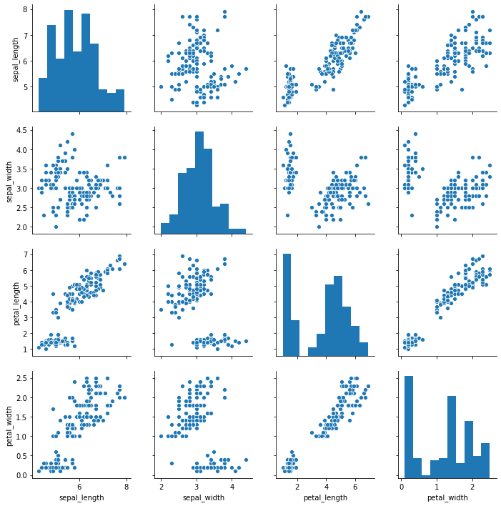
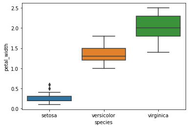
You see how that first figure (the pairplot) has many subplots? That is one type of "Facets". Facets allow you to present more info on a graph by designing a plot for a subset of the data, and quickly repeating it for other parts. You can think of facets as either
- creating subfigures
- the
pairplotdoes this for combinations of variables - the Anscombe example at the top makes subfigures for subsets of the data
- the
- or overlaying figures on top of each other in a single figure
- the categorical
boxplotabove does that for each sub group - the example above in the "omitted group effects" section
- the categorical
With that covered, earlier examples ca begin to make a little more sense.
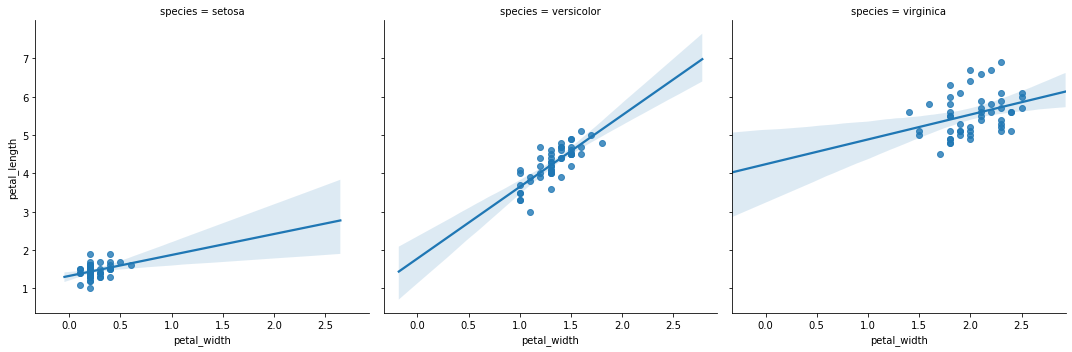
Examining two variables by group
You will come across times where you think the relationship between $x$ and $y$ might on a third variable, $z$, or maybe even a fourth variable $w$. For example, age and income are related, but the relationship is different for college educated women than it is for high-school only men.
If you want to examine the relationship of $x$ and $y$ for each group in $group$, you can do so using any two-way plot type (scatter and its cousins).
The main note is that some functions do this with a hue function (give different groups different colors) and some do it with col (give different groups different subfigures).
| Graph | Code example |
|---|---|
| line | sns.lineplot(x="x", y="y", data=df,hue='group') |
| scatterplot | sns.scatterplot(x="x", y="y", data=df,hue='group') |
| pairplot | sns.pairplot(df,hue='group') |
sns.lmplot(data=iris,x='petal_width',y="petal_length",col="species")
diamonds = sns.load_dataset('diamonds')
diamonds # notice shape, unit, key, etc...

# my turn: lets do the usual immediate explorations including the categorical vars

# my turn: explore carats - how many are 0.99 vs 1 carat? why?

# explore dist of x, y, z: what did you learn? which is width, length, depth?

# your turn: explore price - is there anything unusual? (HINT: try many bin widths)

# my turn: how is carat related to price?

# your turn: how is price related to cut?

# how should we deal with outliers? delete obs? replace with nan? winsorize? show each...
Before next class
- Finish the diamonds practice above
- Make initial (maybe ugly/bad) plots for all exercises in the Visualization Practice page.