3.3.6. Better Plots
3.3.6.1. The theory of good visuals
There is an enormous amount of scholarship and debate about what makes for effective graphs and I can’t possibly do the field justice. Below is simply one person’s distillation of some tips that are reasonably well agreed upon. I’m aiming for concise here so that we can practice, but if you want more, visit the links below.
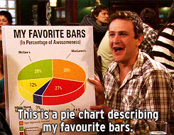
pie charts: humans stink at interpreting angles
stacked bar charts: tough to decode trends
make your reader do math: if \(x-y\) is interesting, don’t plot \(x\) and \(y\) separately, just plot \(x-y\)
misleading scales
3D unless absolutely necessary (and it almost surely isn’t)
distracting chart junk
unnecessary colors
spaghetti charts: too many lines
Show the data, reduce the clutter, and integrate the text and the graph
graphs should aspire to be sufficient to understand without reading the text
Control the aspect ratio
Think about whether you need to include zero. Sometimes excluding it makes the figure misleading. Sometimes including it (and expanding the y-axis to do so) hides the variation you’re describing.
Facilitate comparisons:
by placing figure components next to or above (depends!) the stuff it is compared to
by using the same axis (two y-axes is usually bad!)
labels > legends! (so readers’ eyes don’t have to dart back and forth)
sort in meaningful orders (i.e. not alphabetically!)
3.3.6.2. Transforming bad figures to good ones
Look at the before/after examples here. This article is also wonderful for understanding the “why”s of good data viz