3.3.3. Which Plot Type Should I Use?
This a brief listing of common graphs and their functions
The functions below are but a little tasting of common plots, and I’m not specifying parameters beyond the utterly necessary. pd and sns functions get their flexibility from the wide assortment of parameters you can alter. Changing the parameters a bit can produce large (and interesting!) alterations. For example, col and hue typically multiply the amount of info in a graph.
You can either read the function’s documentation (and I frequently do!) via SHIFT+TAB or look through the
graph example galleries here and here until you see graphs with features you want, and then you can look at how they are made.
3.3.3.1. Common plot functions
Examining one variable
Note
Below, if I call something like df['variable'].<someplottype> that means we are using pandas built-in plotting methods. Else, we call sns to use seaborn.
If the variable is called \(x\) in the dataset,
Graph |
Code example |
|---|---|
frequency count |
|
histogram |
|
KDE (Kernel density est.) |
|
boxplot |
|
The countplot/bar graph counts the frequency of values (# of times that value exists) within a variable and is best when there are fewer possible values or when the variable is categorical instead of numerical (e.g. the color of a car).
The others examine the distribution of values for numerical variables (not categorical) and also work on continuous variables or those with many values.
Examining one variable by group
If you want to examine \(y\) for each group in \(group\)
Graph |
Code example |
|---|---|
boxplot |
|
distplot |
|
violinplot |
|
Tip
Most functions accept some subset of hue, row, col, style, size. Each of these add new facets to your graphs. Facets are ways of either repeating graphs for different subgroups or overlaying figures for different subgroups on each other.
Examining two variables
Graph |
Code example |
|---|---|
line |
|
scatterplot |
|
scatter + density |
|
with fit line |
|
hexbin |
|
topograph |
|
pairwise scatter |
|
binned scatterplot |
Use |
Examining two variables by group
Graph |
Code example |
|---|---|
line |
|
scatterplot |
|
pairplot |
|
You will come across times when you think the relationship between \(x\) and \(y\) might depend on a third variable, \(z\), or maybe even a fourth variable \(w\). For example, age and income are related, but the relationship is different for college-educated women than it is for high-school only men.
If you want to examine the relationship of \(x\) and \(y\) for each group in \(group\), you can do so using any two-way plot type (scatter and its cousins).
Hue vs Col
Some functions achieve the group analysis with a hue argument (give different groups different colors) and some do it with col (give different groups different subfigures).
Many variables - Examining correlations
1.Correlation heatmap.](04e-visualEDA.html#getting-the-big-picture-with-heatmap-with-correlations) but this is just a starting point! Remember that basic correlations can hide the true nature of the relationship
Pairplots (
sns.pairplot) are nice but the default output for realistic and large datasets is bad. You will need to randomly sample the data, use the “hex” option, or the “alpha” option.Custom pairplots, like
pairgrid_hex_reg, can overcome the issues above.
3.3.3.2. Faceting
Facets allow you to present more info on a graph by designing a plot for a subset of the data and quickly repeating it for other parts.
You can think of facets as either
creating subfigures
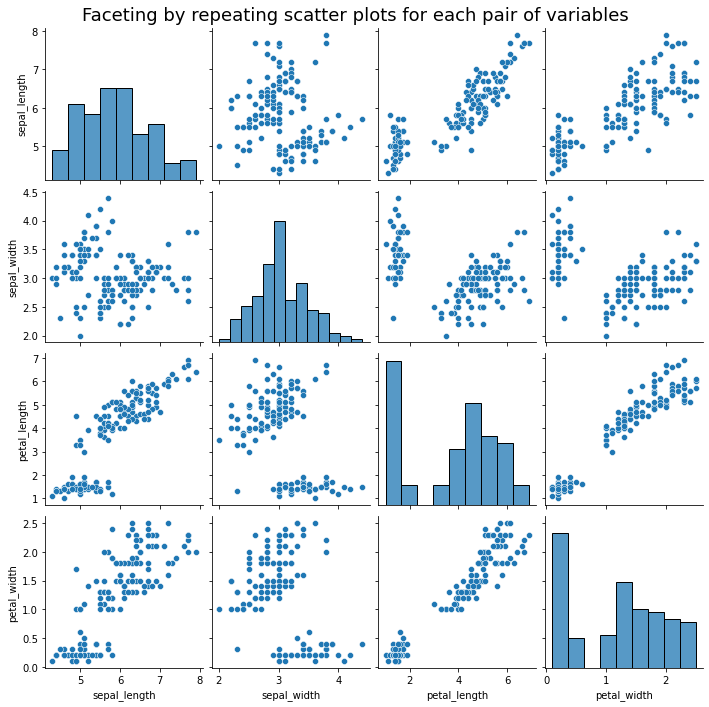
the
pairplotbelow creates subfigures for each combination of variables in the datasetthe Anscombe example makes subfigures for subsets of the data
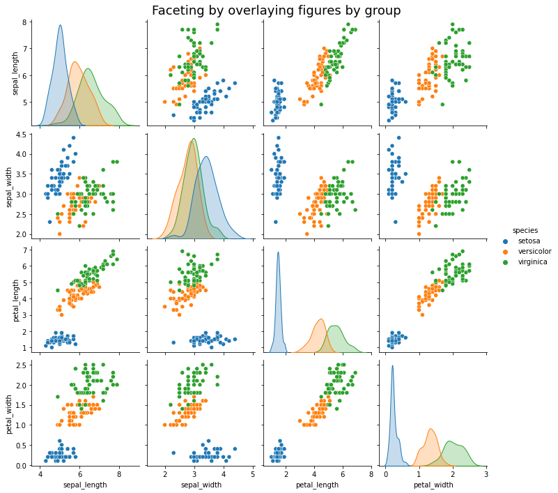
or overlaying figures on top of each other in a single figure
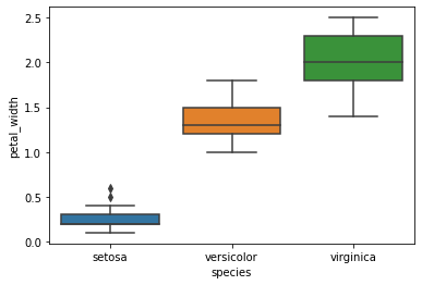
the categorical
boxplotbelow does this for each subgroup
Let’s look at some examples quickly:
import seaborn as sns
import matplotlib.pyplot as plt

iris = sns.load_dataset("iris")
sns.pairplot(iris)
plt.suptitle('Faceting by repeating scatter plots for each pair of variables',fontsize=18)
plt.subplots_adjust(top=0.95) # Reduce plot to make room for the title
plt.show()

# note: .set(title) doesn't work here - it tries to title the individual subfigures (axes)
#       to title the whole thing, I had to use suptitle.
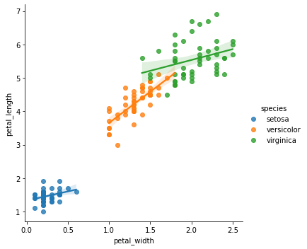
This is the same, plus a hue="species" parameter in the graph function.
sns.pairplot(iris, hue="species")
plt.suptitle('Faceting by overlaying figures by group',fontsize=18)
plt.subplots_adjust(top=0.95) # Reduce plot to make room for the title
plt.show()
Boxplot by group: Just use the x and y arguments together.
sns.boxplot(x="species",y="petal_width", data=iris,)
plt.show()
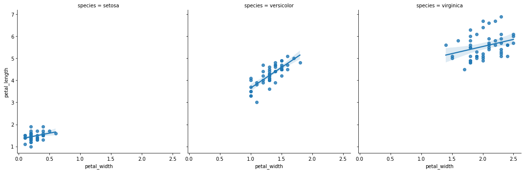
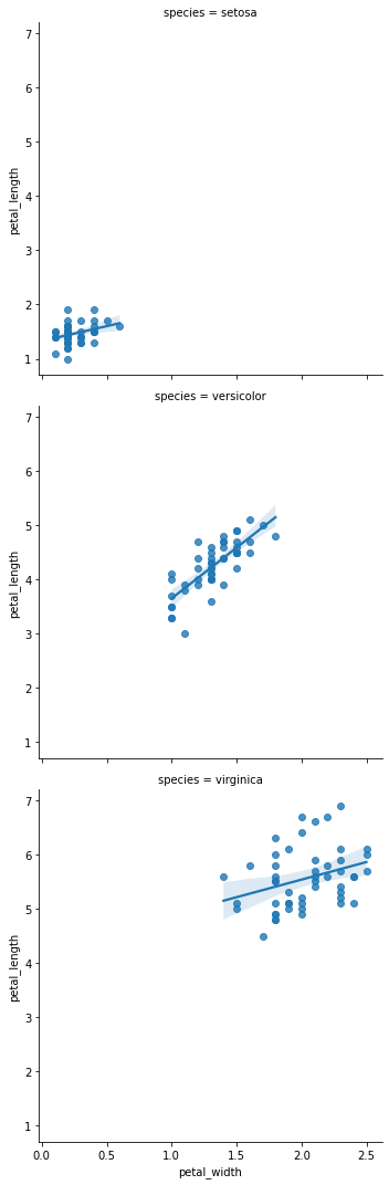
An example of faceting via the col argument. Using row instead does what you’d think. Protip: You can use row and col together to make a grid of groups.
sns.lmplot(data=iris,x='petal_width',y="petal_length",col="species")
plt.show()
sns.lmplot(data=iris,x='petal_width',y="petal_length",row="species")
plt.show()
sns.lmplot(data=iris,x='petal_width',y="petal_length",hue="species")
plt.show()
3.3.3.2.1. I want to Facet my figure, but…
Problem: The variable you want to facet/group by is
(A) continuous variable
or (B) a variable with too many values.
Solutions:
(A) - partition/slice/factor your variable into bins using
panda’scutfunction.(B) - re-factor the variables into a smaller number of groups, or only graph some of them.
For example: Say you want to plot how age and death are related, and you want to plot this for healthy people and less-healthy people. So you collect the BMI of individuals in your sample. Let’s say that BMI can take 25 values from 15 to 40. The problem is plotting 20 sub-figures is probably excessive. The solution is to use the cut function to create a new variable which is four bins of BMI according to the UK’s NHS: underweight (BMI<18.5), healthy (BMI 18.5-24.5), overweight (BMI 24.5-30), obese (BMI>30).
3.3.3.3. Practice: Thinking and planning
Questions: Which type of graph (bar, line, or histogram) would you use?
The volume of apples picked at an orchard based on the type of apple (Granny Smith, Fuji, etcetera).
The number of points for each game in a basketball season for a team.
The count of apartment buildings in Chicago by the number of individual units.
Answers
Q1
This is a nominal categorical example, and hence, a pretty straightforward bar graph target.
Q2
This is a (nearly) continuous variable, with 82 observations (games). 82 bars is too much for a bar chart. But a line chart, histogram (or density plot), or boxplot would all work.
Q3
Density chart would work, but you could also use a histogram as long as you “bin” apartment buildings (<10 units, 10-50 units, etc…) Note that this variable will be skewed because only a few buildings have 500+ units.