3.3.1. The Role of Viz in Analysis
Plotting is useful for
Exploring data: Understanding the structure of the data is absolutely essential to any analysis.
Discovering and presenting trends, comparisons, and relationships (results): Pictures are worth a thousand words.
A common data science work flow:
Get data
Generate questions (many questions!). See below.
Search for answers by visualizing and modeling data
Refine question, fix data problem, or ask new question: return to step 2 or 3 and proceed
Notice: We’re in an loop now. Point being:
You should be plotting your data A LOT!
For every figure I include in research papers, I’ve created literally hundreds of figures no one else will ever see.
“Investigate every idea that occurs to you. Some of these ideas will pan out, and some will be dead ends. As your exploration continues, you will hone in on a few particularly productive areas that you’ll eventually write up and communicate to others.” (Garrett Grolemund and Hadley Wickham)
3.3.1.1. What questions should I ask / What should I plot?
A smart way to choose what to plot is to ask questions about your data.
For example, what does the distribution of firm investment rates? What fraction of firms are increasing their investment?1 And so on…
How do you pick which questions to ask?
Remember, our goal is to understand new data, so that we can then use that data to learn something. But since you just got the data, asking good questions is hard - you don’t know what’s in the data in terms of problems or insights.
What kinds of questions can I ask? Generally, questions about data fall into two bins:
What type of variation occurs within a variable? Ex: Distributions, time trends
What type of variation occurs between variables?2 Ex: Scatterplots, plots-by-group
Tip
Ask LOTS of questions. Alt: Create lots of plots.
After you ask a question and answer it with a plot, ask a new question that follows-up on what you just learned.
3.3.1.2. Why plot our data?
I know I just said why above in general terms (“exploring data and presenting analysis”) but I want to show you a few classic examples.
3.3.1.2.1. Summary statistics don’t show relationships
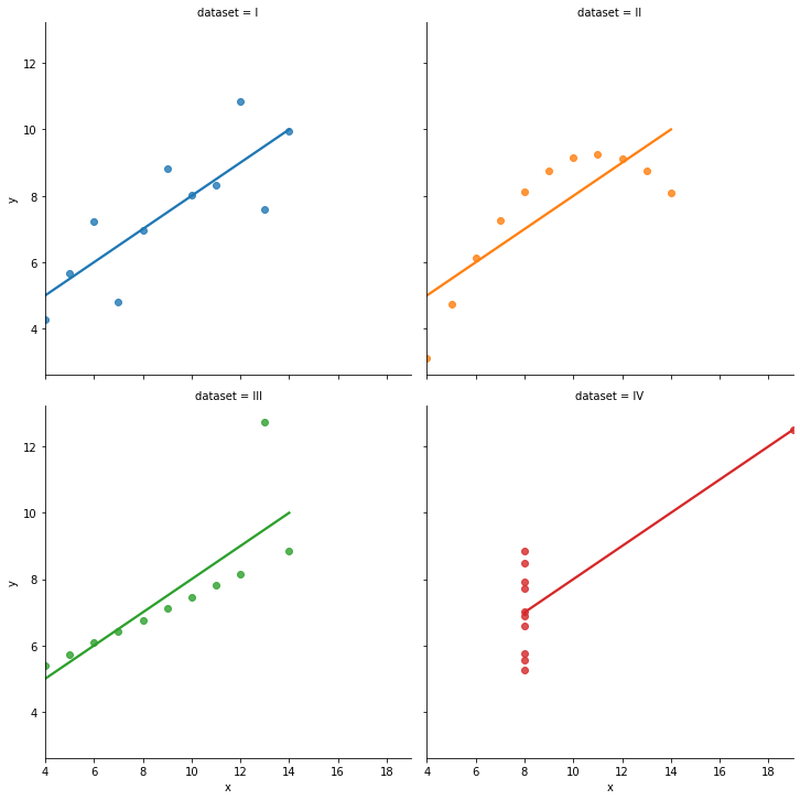
Anscombe’s quartet is four datasets with two variables which have identical means and standard deviation.
import pandas as pd
import seaborn as sns
import matplotlib.pyplot as plt  # sometimes we want to tweak plots
import numpy as np

df = sns.load_dataset("anscombe")
df.groupby('dataset').describe() # works, but a lil ugly...
df.groupby('dataset').describe().swaplevel(axis=1)[['mean','std']] # just report means and std
| mean | std | |||
|---|---|---|---|---|
| x | y | x | y | |
| dataset | ||||
| I | 9.0 | 7.500909 | 3.316625 | 2.031568 |
| II | 9.0 | 7.500909 | 3.316625 | 2.031657 |
| III | 9.0 | 7.500000 | 3.316625 | 2.030424 |
| IV | 9.0 | 7.500909 | 3.316625 | 2.030579 |
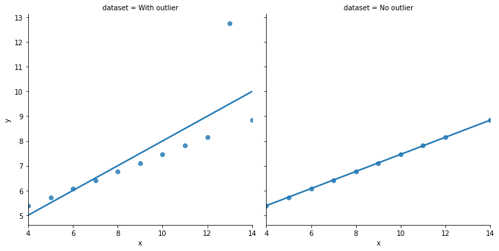
A regressionista says: “\(x\) and \(y\) all have the ‘same relationship’: \(y = 3 + 0.5*x\)”
But… just take one look at the figure below. Is that statement accurate?!
3.3.1.2.3. Finding group effects
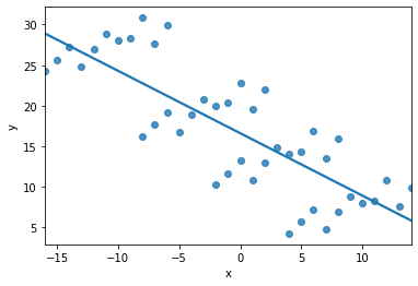
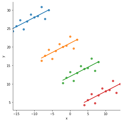
If you regressed \(x\) on \(y\) in the following dataset, the relationship would be “clearly” negative…
… but it should be positive, taking the groups (colored below) into account:
3.3.1.3. Graphs aren’t everything
Visualizations are a powerful and essential tool.
The online book version of “Data Visualization: A practical introduction” by Kieran Healy notes that
Illustrations like these demonstrate why it is worth looking at data. But that does not mean that looking at data is all one needs to do. Real datasets are messy, and while displaying them graphically is very useful, doing so presents problems of its own. [As we will see next lecture], there is considerable debate about what sort of visual work is most effective, when it can be superfluous, and how it can at times be misleading to researchers and audiences alike.
Just like with tables of numbers, graphs deliberately simplify things to help use peer into the cloud of data. Still, we will not automatically get the right answer to our questions just by looking at these summaries. This is why we will cover more rigorous methods to uncover statistical relationships later in the course.
Yet, summary stats and graphs are an absolutely necessary starting point.